This page isn't done.*
*On mobile. Check it out on your tablet, laptop, desktop, television, or IMAX movie theater screen.
The Brief
The Client
Dear Dreamer is a personalized entrepreneurship education platform for youth (ages 12–18, primarily young women) that teaches users how to start a business by actually starting one. Built on MIT's Disciplined Entrepreneurship framework and powered by Orbit's Jetpack AI. Created through a collaboration between the MIT Martin Trust Center for MIT Entrepreneurship and Frank & Eileen, the women's clothing brand founded by Audrey McLoghlin.
My Role
Creative lead for brand and copy. I developed the brand strategy independently and presented three distinct directions to stakeholders at MIT and Frank & Eileen. From there, I built the full identity system and wrote all copy across the brand: voice and tone guidelines, UI copy, and copy editing the curriculum for brand consistency.
I also contributed to product design, developing concepts and delivering designs that were handed off for implementation.

The Challenge:
Make it cool enough for a teenager
to actually want it.
Build it simple enough to be clear,
strong enough to scale.
Find one story that works for
MIT, Frank & Eileen... and a 14-year-old.
the Process
Three Directions
Before arriving at the final system, three distinct conceptual directions were explored. Each was rooted in a different insight about the audience.
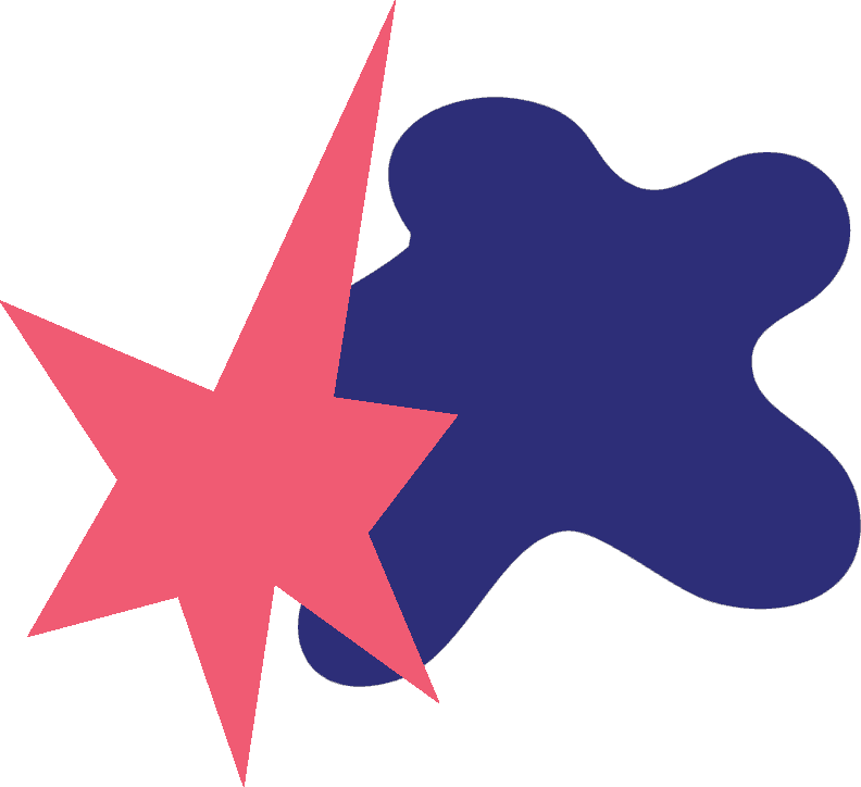
01 Bouba/Kiki
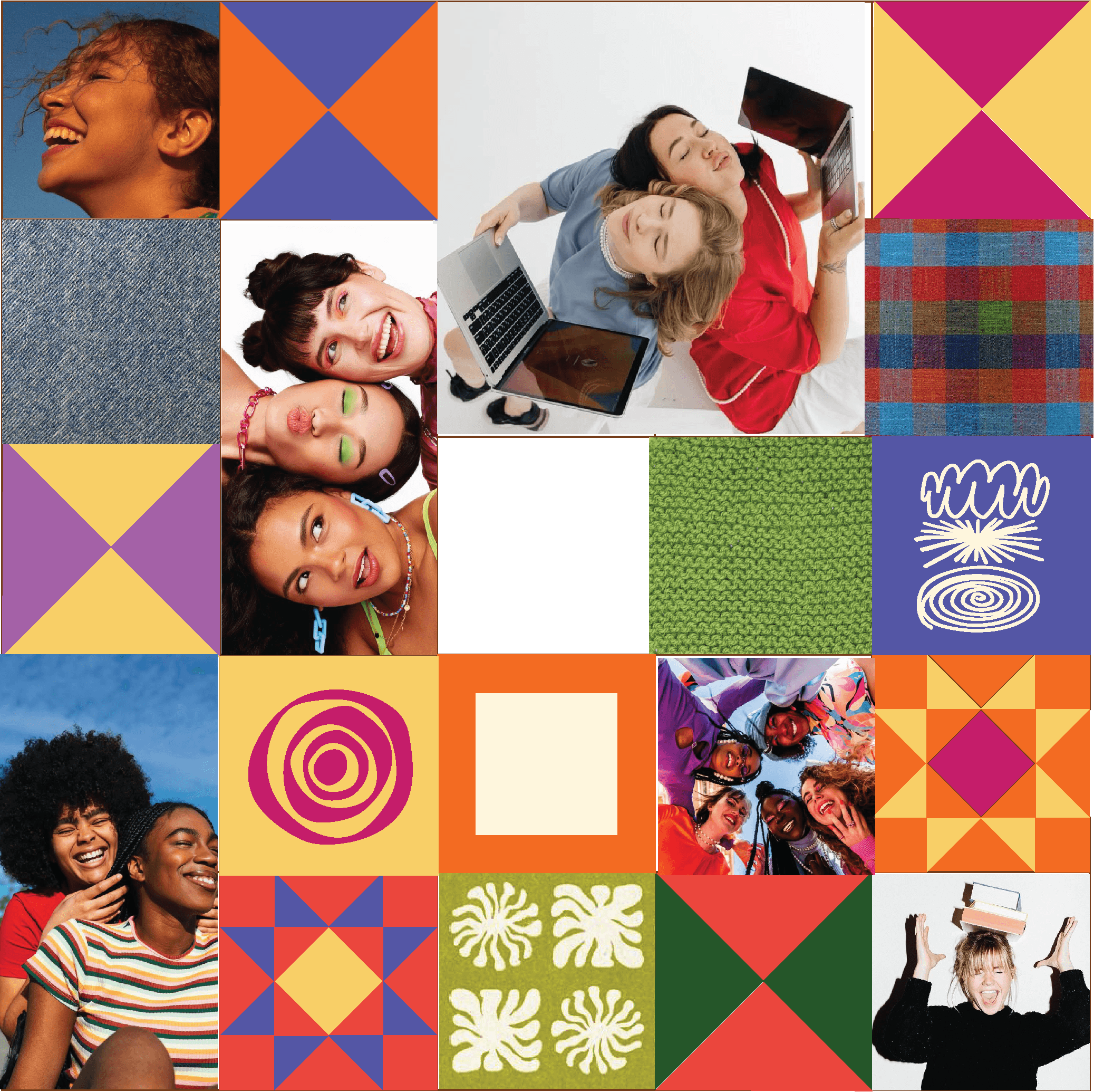
02 Quilts
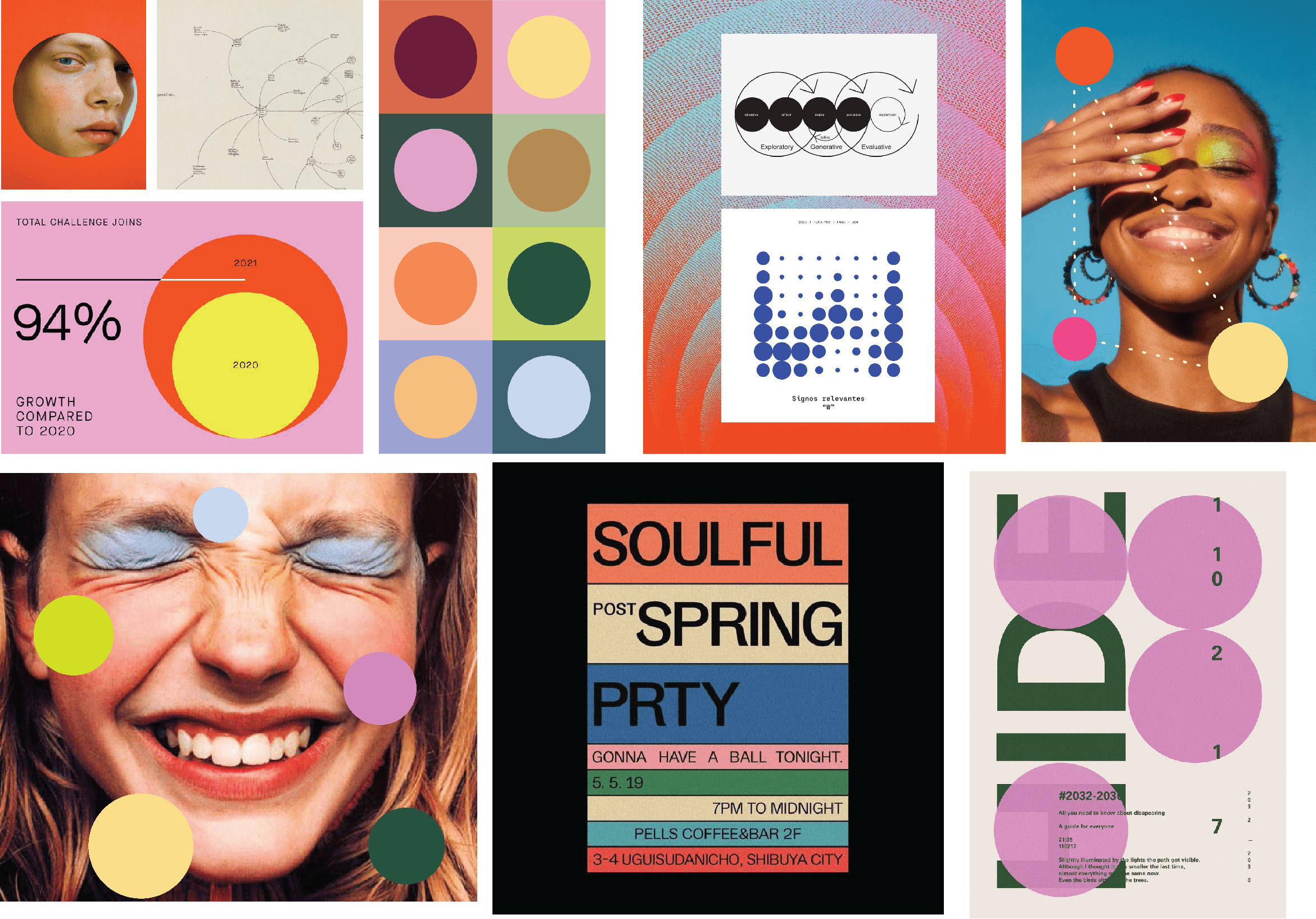
03 Connect the Dots
Direction 1
Bouba/Kiki
The brand lives in the universe between Bouba (the blob, the dream, the soft explorer) and Kiki (the spark, the edge, the clear idea). Each represents a part of the creative process: chaos vs clarity, feeling vs form, exploration vs decision.
Confident but not overbearing
Vibrant but intentional
Expressive without being chaotic
Teenage girls are a contradiction of confidence and vulnerability — our brand should be too.

Direction 2
Quilts
Teens are learning how to build something with support — a system — but they’re also making it undeniably theirs.
The grid = the learning system. The quilt = the self-expression within it.
Aligned with the AI contrast — AI can spit out templates, but it can’t make a quilt. It can’t decide what matters to you, or how to make it yours.
Direction 3
Connect the Dots
Ultimately, this is a tool to help you connect the dots of your idea and make it into one cohesive picture.
For the teens in this program, that means connecting their own dots: culture, creativity, values, and ambitions.
It’s playful, it’s youthful, but it’s refined and colorful and doesn’t underestimate teens.
The Decision - Brand STory
Why Connect the Dots Won
Storytelling
Dear Dreamer helps young people connect the dots — their culture, creativity, values, and ambitions.
They already have all the tools they need to be an entrepreneur.
We explore these connections through circles and paths: soft, approachable shapes linked by jagged, energetic lines.
We use bright colors and playful shapes while keeping the design polished; meeting young people where they are and making exploration fun and inviting.
Colors
Color Palette
Dear Dreamer’s color palette balances boldness with approachability, designed to reflect the energy and creativity of entrepreneurship.
Our palette is anchored by the calm neutrality of Fresh Canvas and the grounded depth of Trailblazer. Secondary tones add sophistication and contrast, while bright accents bring pops of energy to icons, graphics, and moments of emphasis.
Primary
Main Character
#CDCC73
205, 204, 115
0, 0, 44, 20
Pivot
#F7CD68
247, 205, 104
0, 17, 58, 3
Ambition
#325342
Trail-blazer
50, 83, 66
40, 0, 20, 67
#FDFAEF
Fresh Canvas
253, 253, 245
0, 0, 3, 1
Secondary
Accent
Resolve
#2D2829
45, 40, 41
0, 11, 9, 82
#DE93C0
219, 119, 179
Lucid
0, 46, 18, 14
#481222
72, 18, 34
Scale
0, 75, 53, 72
#304071
48, 64, 113
Ballpoint
58, 43, 0, 56
#DF623A
223, 98, 58
Momentum
0, 56, 74, 13
First Step
#F0C5D7
240, 197, 215
0, 18, 10, 6
#DC5689
220, 86, 137
0, 61, 38, 14
Typography
Aa
Awesome Serif
Header/Display
Used for display text and headers. A modern serif with elegance and personality. Used in both upright and italic.
Aa
Archivo Extended
Body Copy
Used for body copy. Clean, wide, highly readable.
Aa
All Round Gothic
Accent
A modern, playful geometric sans-serif. Used for accent text, labels, UI moments where personality matters.
Logos
Logos
The icon is a multi-pointed starburst with multicolored dots and dotted lines radiating outward. It's the concept made visible.
The full multicolor icon lives on Fresh Canvas and white only. On colored backgrounds, it simplifies to a single color. Flexible without ever losing itself.

Logos
Additional Logos
I built a comprehensive logo system for Dear Dreamer. There are four configurations: horizontal lockup (primary), vertical, wordmark only, and icon only. From a billboard to a favicon, the mark holds.
Vertical - Simplified

Horizontal - Simplified

Icon
Brand in use
Kiki
Kiki is a companion who lives on the user’s learning path. I designed Kiki and helped integrate it into the program, including all copy.

My Role
Creative lead for brand and copy.
What that included
Brand strategy developed independently and presented to stakeholders at MIT and Frank & Eileen. Full visual identity system, color, typography, logo, and brand book. All copy across the brand: voice and tone guidelines, UI copy, and copy editing the curriculum for brand consistency. Product design contributions developed and handed off for implementation.
Context
First project out of college. Launching July 2026.
