

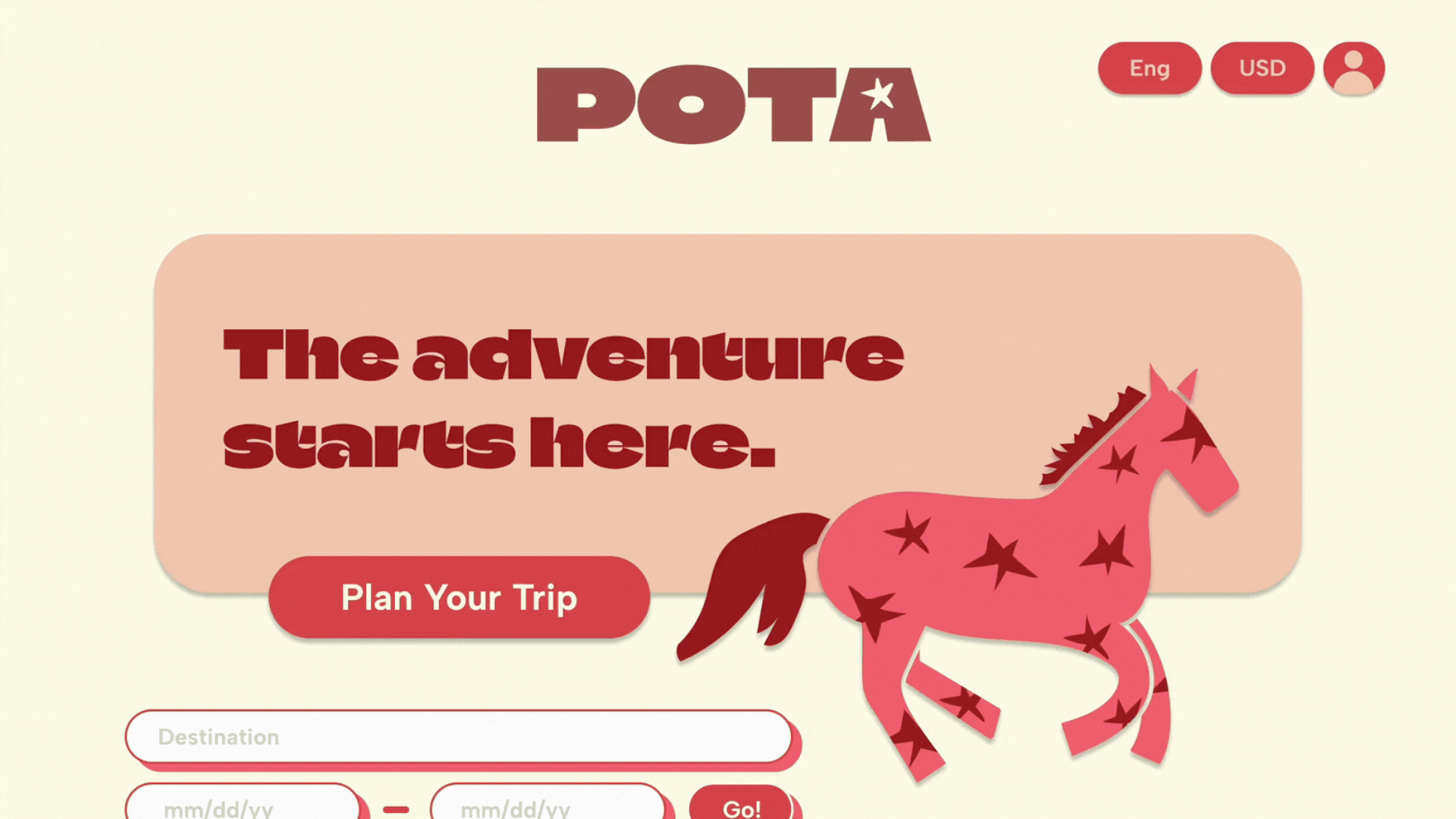
A budget travel agency for Gen Z nomads.
What the heck is a POTA???
Well, it’s our name. And it’s also an acronym. And it means PART OF THE ADVENTURE. We love our name. We're so proud to be a part of YOUR adventure.
But we have to be honest here: we can’t take credit. The name came from our type A founder’s type B best friend, who used to shout gleefully when things went wrong:
“It’s all POTA!!!”

Brand Story
POTA is short for Part Of The Adventure -- as in, it's all part of the adventure. Travel is messy, and things don't always go as planned, especially when you're backpacking on a shoestring budget. This philosophy guides us: you have to embrace the mess.
From denied visas to flooded hostels to missed flights and everything in between, what I've realized is that enjoying backpacking takes a certain kind of attitude -- a willingness to sit back, take it in, and recognize that it's all part of the adventure.
POTA exists to make your adventure smoother. We're made for a certain type of traveler -- people who are ready to get their hands dirty in the gritty world of backpacking. POTA helps find cheapest way to see the world and hopes you find adventure in the process.
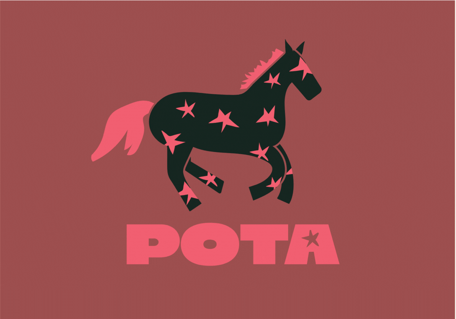
And what's with that horse?
We're talking transportation, baby! Before trains, planes, and automobiles, there was the humble horse. And POTA is all about getting back to basics. While backpackers won't (typically) be galloping to their next destination, POTA powers simple, humble travel: shared accommodation, local food, and the cheapest way from A to B.
And on a more personal note, the logo is also a tie-in to the friend who inspired the brand -- we used to ride horses together growing up.
.png)


AI Integration
At POTA, we know the stories worth telling often come in the in-betweens of traveling -- a new friend on a layover or a mad dash to the connecting bus stop. We're the travel agency for people who are ready to embrace every part of the adventure.
We help you organize your trip from start to finish -- just by having a conversation. Whether you're a meticulous planner or a spontaneous one, we've got tools to get you out there.

Brand Colors
Our colors are bold, a little gritty, and not too polished — just like travel itself.
They pull from the mix of chaos and charm you find on the road: vibrant nights, worn-in gear, and the unexpected moments in between. The palette is practical but playful, made to stand out without feeling fancy.
It’s built to feel approachable, adventurous, and unafraid of a little mess.
Typography
The POTA type system combines three fonts with distinct roles. Climate Crisis is used for bold accents and key statements. Albert Sans serves as our header font, providing clarity and structure. Barlow is our body font, designed for readability across longer text. Together, they create a hierarchy that balances impact with usability.
See you out there!
Climate Crisis
Aa
Header
Albert Sans
Aa
Barlow
This is body copy. Dus, si blabo. Nam, ut haribusam qui res endiate ndestia voluptatur, escil ipsumqui dolori te doluptur, il et milibererro dolorrovit, consect iorepra voloriorro modissimusa in ped ut qui omnis essum consequi blautemqui ut rendenimaio odis errorum etusdan demperias moloritempor abor ma dolore, te parum ex et ommodicius.
Aa
Logo System


